As you can see above, the province of Nova Scotia is now providing a graphical resprentation of the Covid-19 data. Further, the province has real laboratories, one of which processed an astounding 900 tests on Wednesday.
If journalists and lab technicians have the time, I think this is an accomplishment that derserves some coverage.
Turpin Laboratories, which is imaginary, will now find something else to do. Our staff are simply too exhausted to compete with the province.
Lastly, young whippersnappers take note: The province’s site has a breakdown Covid-19 cases by age group. You can no longer say you weren’t warned.
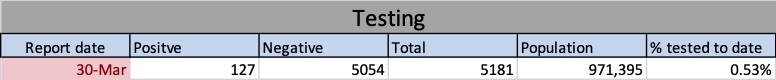
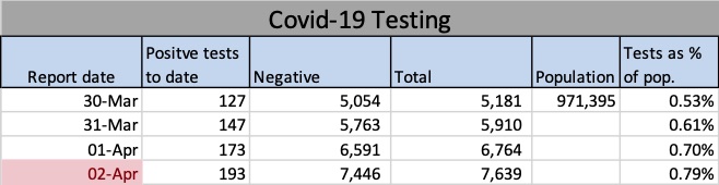
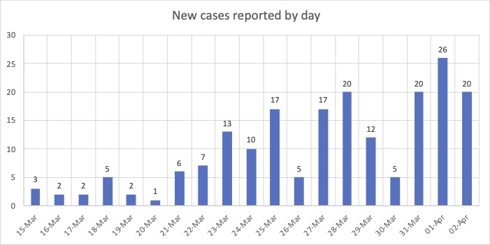
Above are the data used to create the charts and graphs you’ll find below. The cell highlighted in red shows when I last updated them.Above: “Positive cases to date” reflects confirmed cases of Covid-19 in Nova Scotia, e.g., 147 on March 31. Negative results and the total number of tests administered in the province are also shown. The rightmost cell shows the total for tests as a percentage of the population.The chart above (New cases reported by day) shows the number of Covid-19 cases reported each day by NS public health. For example, the first three cases were reported on March 15, two more were reported on March 16 and another two on March 17. The chart below (Running total) shows what happens when you add those number up. For example, the number corresponding to March 17 below is seven, the sum of March 15,16, and 17 above (3+2+2=7). You can find the news releases on the government’s searchable database at https://novascotia.ca/news/.The chart above is the result of summing all the available results as of date on the horizontal axis. The number 147 does not mean 147 cases were reported on March 31: rather, it’s the total of all 17 reports from March 15 to March 31, inclusive. As you can see on the bar chart, only 20 new cases were reported on March 31.
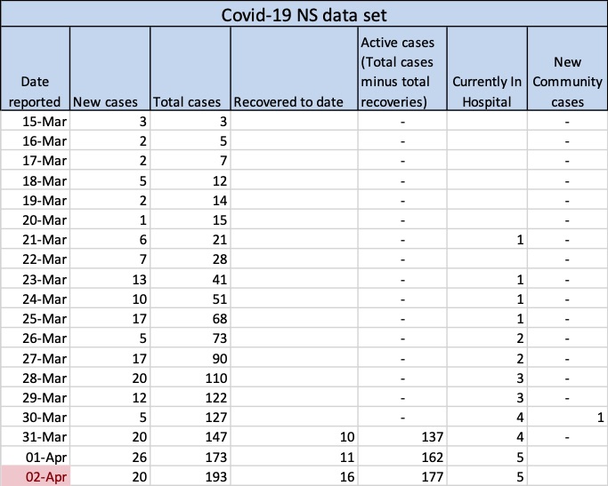
This post contains NS data on the Cover-19 outbreak here and will be updated regularly. You can see that as of April 1 a total of 173 cases had been reported. (Please note the name of this blog, Turpin Laboratories, was a tongue-in-cheek choice made during happier times. I am not a laboratory and possess no scientific expertise.) Everything below is presented for your reference only. Drawing conclusions from these data is is ill-advised unless you’re an expert. Further, you can see from the way the numbers jump around that predictions would be meaningless — especially, to paraphrase Yogi Berra, if they’re about future.
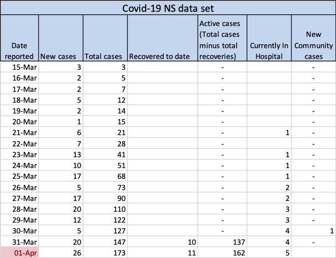
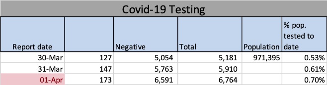
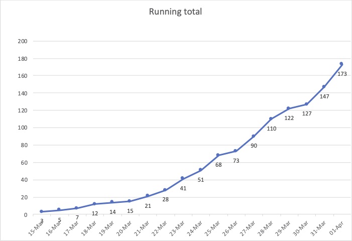
Above are the data used to create the charts and graphs you’ll find below. The cell highlighted in red shows when I last updated them.Above: “Positive cases to date” reflects confirmed cases of Covid-19 in Nova Scotia, e.g., 147 on March 31. Negative results and the total number of tests administered in the province are also shown. The rightmost cell shows the totals tests as a percentage of the population.The chart above (New cases reported by day) shows the number of Covid-19 cases reported each day by NS public health. For example, the first three cases were reported on March 15, two more were reported on March 16 and another two on March 17. The chart below (Running total) shows what happens when you add those number up. For example, the number corresponding to March 17 below is seven, the sum of March 15,16, and 17 above (3+2+2=7). You can find the news releases on the government’s searchable database at https://novascotia.ca/news/.The chart above is the result of summing all the available results as of date on the horizontal axis. The number 147 does not mean 147 cases were reported on March 31: rather, it’s the total of all 17 reports from March 15 to March 31, inclusive. As you can see on the bar chart, only 20 news cases were reported on March 31.